We all know that you shouldn’t judge a book by its cover, but we also know that more often than we probably care to admit, we do it anyway. The same goes for how your website looks. If you want to sell more books, you have to acknowledge the importance of web design for your author website. Why? Let me share with you some sobering statistics.
In a Stanford University study, 75% of web users admitted to making judgments about a company’s credibility based on its website design. And it gets worse: That impression is often made within the first 50 milliseconds (0.05 seconds). Visitors to your site base their opinion in that short period of time primarily on design. 94% of a website user’s first impressions are design-related.
So, what is an author to do? Here are some tips to help you create an effective and attractive author website:
Infuse Your Site Design with Your Personality
A lot of factors go into creating a strong and effective site design, but one of the most important is making sure your design conveys the right personality for your brand. Think about the kind of image you want to project. Are you professional and straightforward? Creative and quirky? Relaxed and approachable? It’s important to make sure that your web design is consistent with your brand’s overall persona.
Once you have a sense of your brand’s personality, you can start to think about how that personality should be reflected in your design. What colors and fonts will best convey that image? How should your content be organized? Answering these questions and carefully crafting your website’s appearance, will help you connect with your target audience.

Structure Your Navigation for Ease-of-Use by First Time Visitors

The hierarchy of your pages and posts is a critical factor in site design. This first layer of organization informs the navigation of your website, which should be well thought out and considerate to how people will move about the site.
The importance here isn’t just about having an organized layout but also making sure that each page can easily connect back into its respective category or topic area because this will help users find what they are looking for quickly and easily without being overwhelmed by too many options at a time.
Remember, the navigation is not there for you (although you will probably use it more than anyone else, it is there for first-time visitors. Someone should be able to find what they need without having to search too hard. And the easier you make finding things, the longer a visitor is likely to stay. This decrease your “bounce rate,” which is a metric that Google uses to determine the relevance of your website.
Use Color and Images to Make Your Site Appealing and Sticky
In a survey conducted by Top Design Firms (2021), respondents indicated that images, color, and video were their preferred visual elements:
- 40% valued images the most
- 39% were drawn to a website’s colors
- 21% preferred video the most
Given these results, it is clear that selecting the right color pallet and imagery is of primary concern for good web design. And, when it comes to images, larger is better – as long as it is high quality. In addition, according to a Jakob Nielsen study, images of ordinary people (like you!) are more appealing than images of people who look like models. (That warms the cockles of my heart because no one has accused me of looking like a model. LOL.)

Embed Video to Improve Trust and Retention

After you’ve gotten the images and color for your design selected and working to communicate your brand effectively, layer in some video. It may sound crazy, but even if no one watches the video embedded on your website, it still improves your trust factor. Videos indicate that you believe in your book. Why go to the trouble of creating a video in a book you don’t care about? The fact that you created it and posted it, sends a subconscious trust signal between your brand and the website visitor.
In addition, not everyone will want to read the content on your site. Some would rather watch a video. This is because different people have different preferred communication and learning styles. Offering different modalities for consuming the content on your site, increases the chances that someone will stick around and consume it.
These are the four types of videos that work well for author websites:
Introduction Video
This video provides the viewer with a little information about the author and their work. It can be a straightforward “talking head” type video, an interview clip video, or something artistic and stylish.
Book Trailers
These videos are movie-trailer-style commercials about the author’s books. They come in a variety of styles. You can view some of the videos I created for the second edition of Home Sweet Home at the bottom of the book’s sales page.
Testimonials and Reader-Created Videos
These videos show case how readers love your work. You can record testimonials at book-signing events or after presenting a webinar or other virtual event. Or you can hold contests and giveaways where your readers create fun videos showing of their fandom to win a prize. (Watch the Svengoolie movie that airs on Saturday nights on MeTV and you’ll see a segment with Sven shows off art and photographs that his fans send him. You can do the same thing!)
Deeper Dives
Create instructional videos that go show off the research you did to write your book or share how to do something either discussed in your book or that one of your characters does in your book.
7 Author Website Design Examples and Why I Like Them
Here are seven author websites, drawn from authors who are selling really well in 2022. For each site I’ll share what they seem to be doing right so you can decide if it would work for your own goals and needs as well.
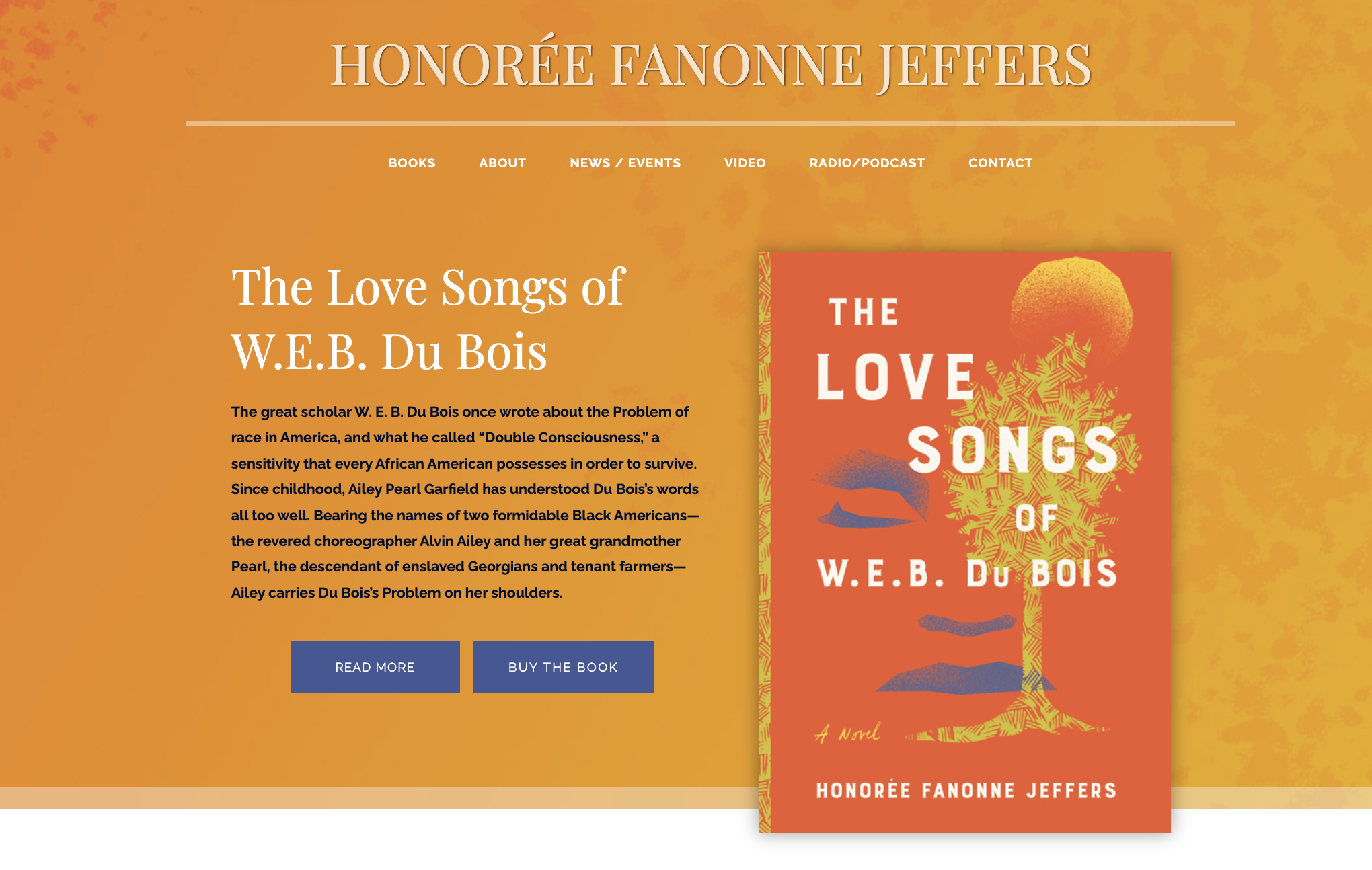
Honorée Fanonne Jeffers
When you land on Honorée’s website, you are greeted by a bold and cheerful color pallet and an image of her book, The Love Songs of W.E.B. DuBois. The navigation is simple and unobtrusive. When you scroll down the page, you can read quotes about the book, and finally near the bottom there is a picture of her and some biographical information. Her site makes it clear that she is proud of her work and would like to share it with you. I like that you get a feel for her straightforward style from the aesthetic of her site.
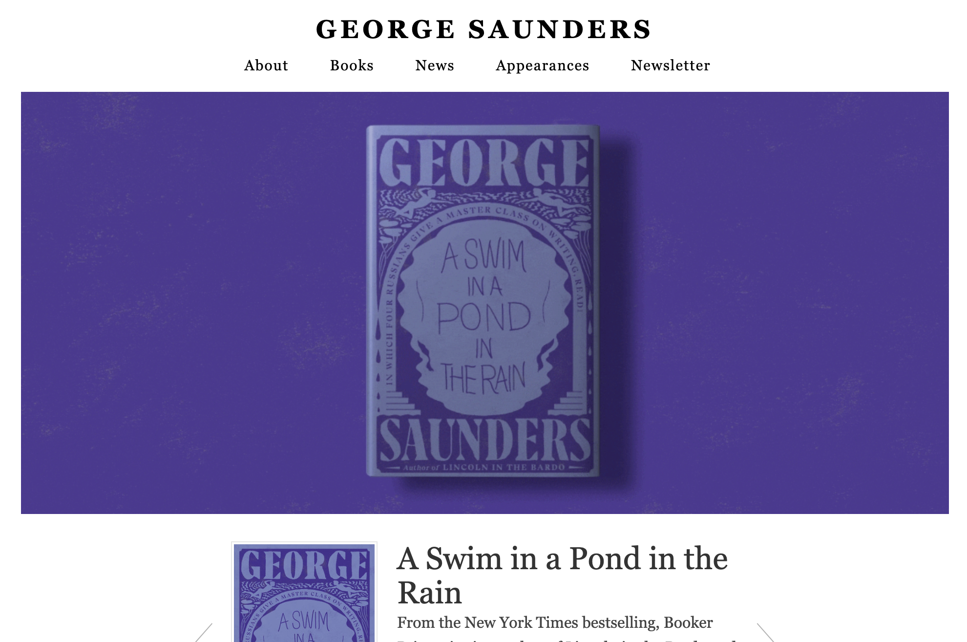
George Saunders
Honestly, George’s site, as a whole isn’t that impressive. It is plain and simple. However, he got me to stay on the site for longer than I would have because the big image of his book moves. He uses an animated gif of his book cover that starts out plain and gradually reveals itself as his “hero image.” That was clever and captivating. How might you use movement to catch a visitor’s eye and keep them around long enough to learn more about you and your work?

Diane Chamberlain
I got a clear sense of brand when I landed on Diane’s website. Her name is big and bold – therefore I know she is branding herself rather than her book. And the image that is the backdrop behind the image of her book gives you the impression that her work is suspenseful and moody. Go down the page, and you’ll discover that she writes “suspenseful stories that touch both heart and mind.” Great branding, Diane!
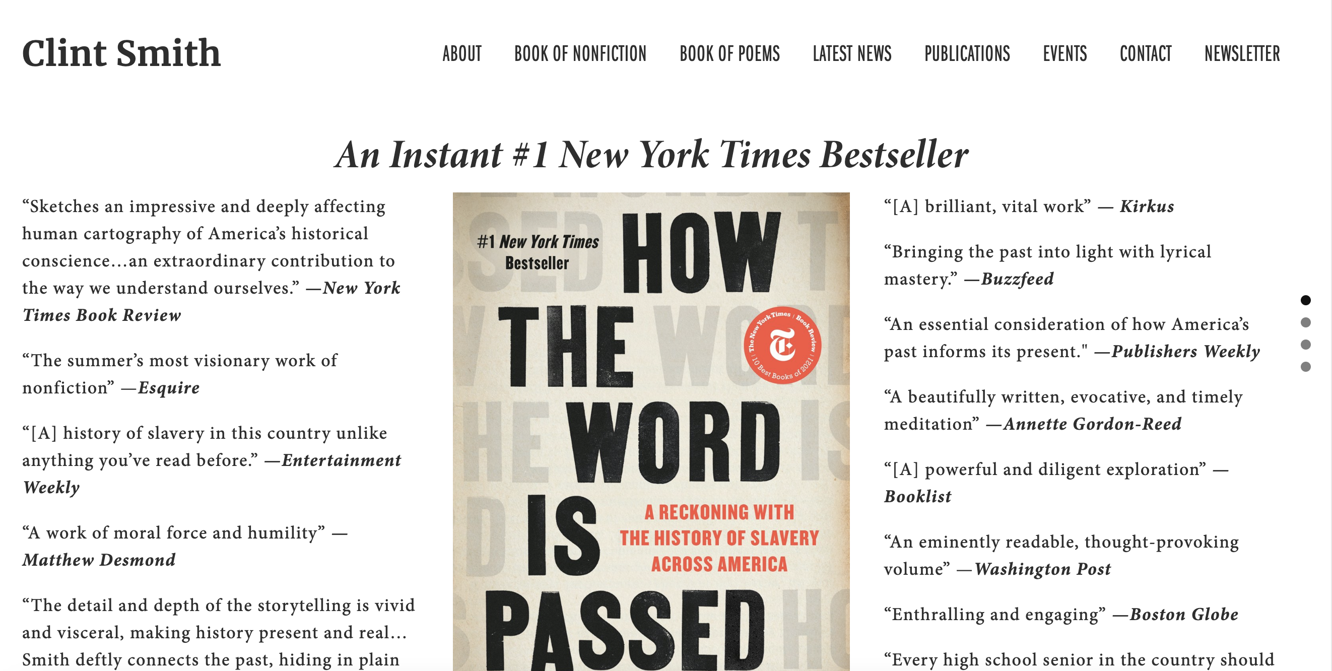
Clint Smith
There is a simplicity and power to Clint’s site. His book is front and center, surrounded by accolades. Without even reading the title or what the book is about, I’m already curious to learn more. This site uses social proof in a potent way that works on the subconscious. If you have enough awards, testimonials, and so forth that you can showcase, do it. Social proof sells books.

Carol Shaben
Remember how I said that images of ordinary people are more appealing than images of models? Carol uses this to her advantage, showcasing herself is an artsy black and white image that hints at her personality. Her eyes are smiling to greet you as you land on her home page. And then there is her tagline: Author. Journalist. Humanist. The image matches her message perfectly.

Patrick Radden Keefe
Here is another author showcasing his own image on his homepage. But Patrick uses a color image, and he looks more serious. However, a quick look at the titles of his book and you’ll see how well this image matches his brand. His topics are sober, serious, and straightforward – much like the impression I got from the image.
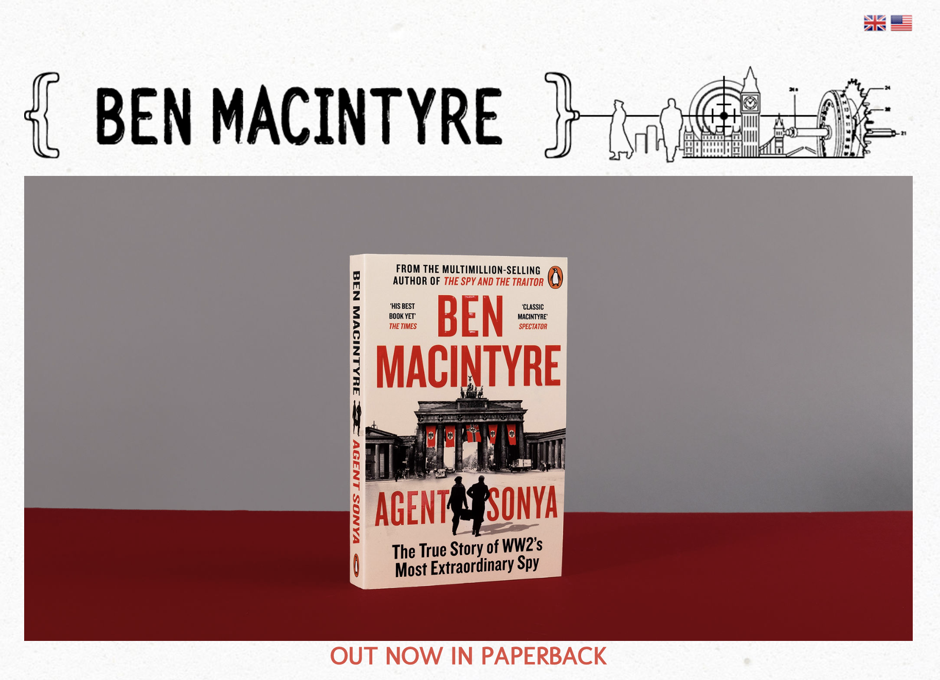
Ben Macintyre
If all you saw was Ben’s header, which contains his name and a simple logo-like image, you would get an instant feel for the types of books he writes – Spy stories. You might not know if they were truth or fiction, given the visuals, but if you like spies, then you might not care.
What Have We Learned?
Your website design should reflect your personality and be easy to use for first-time visitors. Use color and images to make it appealing and sticky and embed video to improve trust and retention. If you want help creating a website that reflects your unique brand and drives sales, my author branding workshop might be perfect for you. Check out the workshop page to learn more about what’s included.
Want the Steps to Publishing as an Authoneer?
